Documentation Index
Fetch the complete documentation index at: https://docs.runway.com/llms.txt
Use this file to discover all available pages before exploring further.
Creating a new chart block
- To add a new block to a page, type / to access block options.
- Select Driver charts.
- Choose the drivers you’d like to visualize on the chart. You can add or remove drivers later, not just when first creating the block. More details on this in the driver customizations section.
- By default, each driver is displayed as a separate line chart. You can change the chart type or combine drivers into a single chart to better suit your needs.
General charts customizations
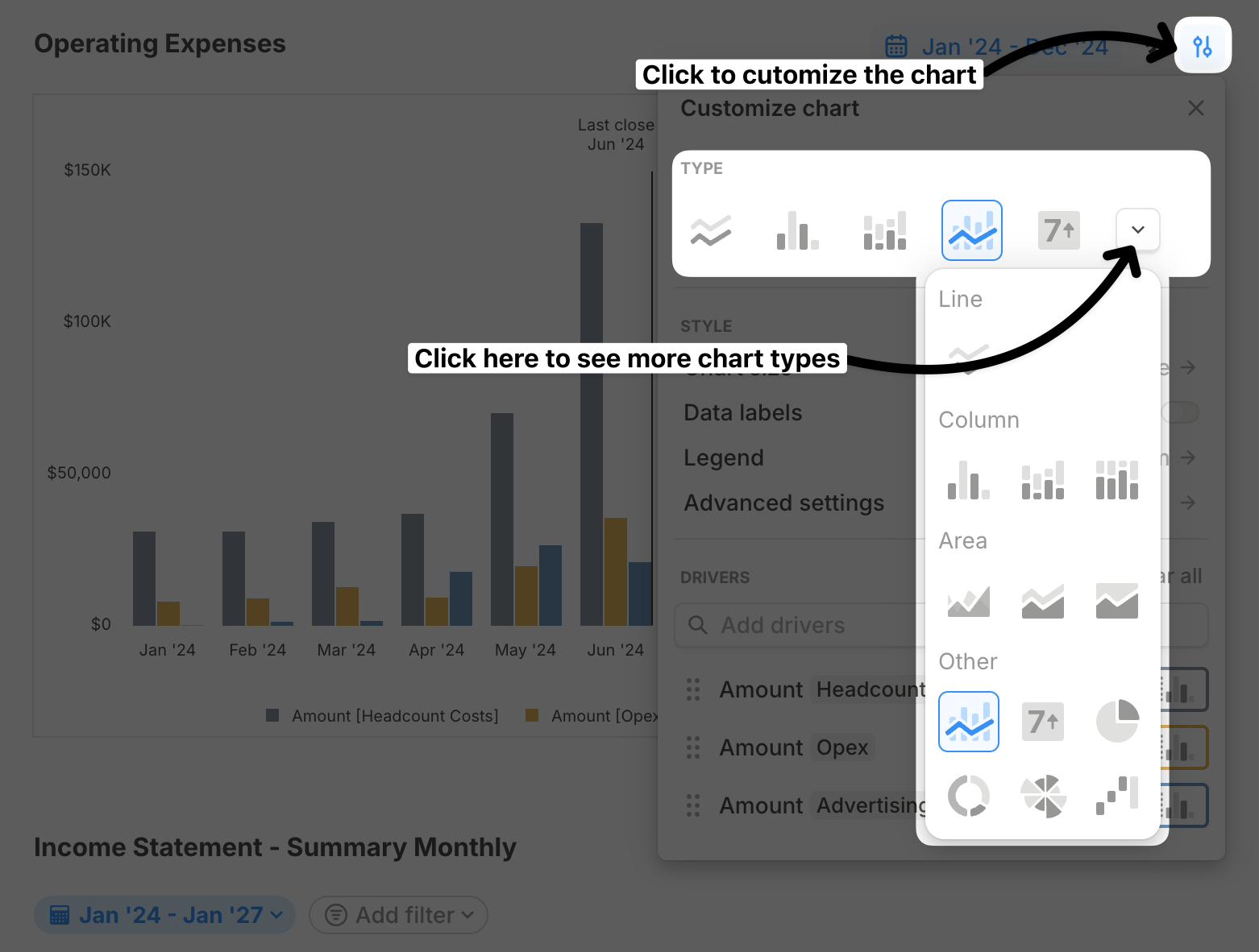
Chart blocks give you control over how your data is visualized, so you can make it as simple or detailed as you need. Whether you’re switching chart types, adjusting size, or tweaking labels, these options help you present your data in a way that makes sense.Choose from many chart types
Runway supports multiple chart types, including:- Line
- Column
- Stacked column
- 100% stacked column
- Value
- Area
- Combo
- Waterfall
- Pie
- Donut
Combine charts
By default, each driver is displayed separately, but you can combine multiple drivers into a single chart for a more consolidated view.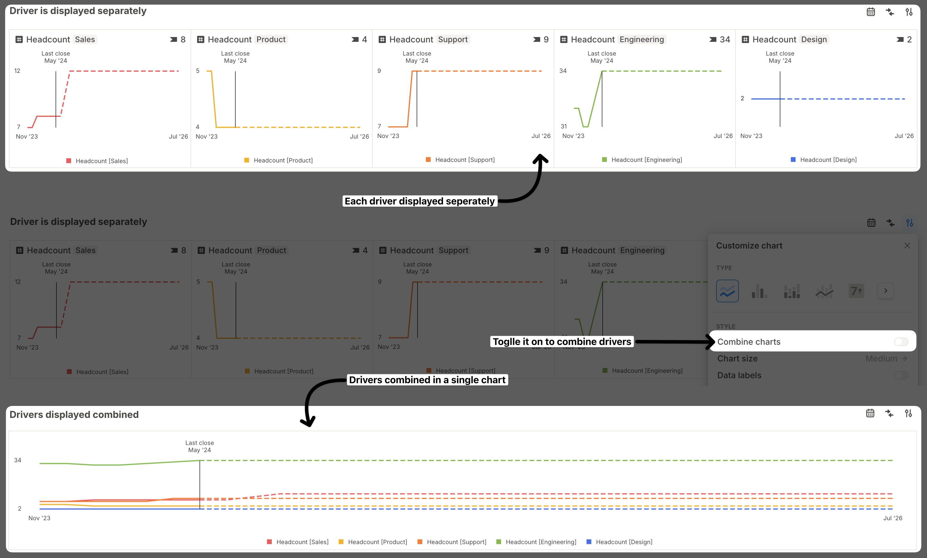
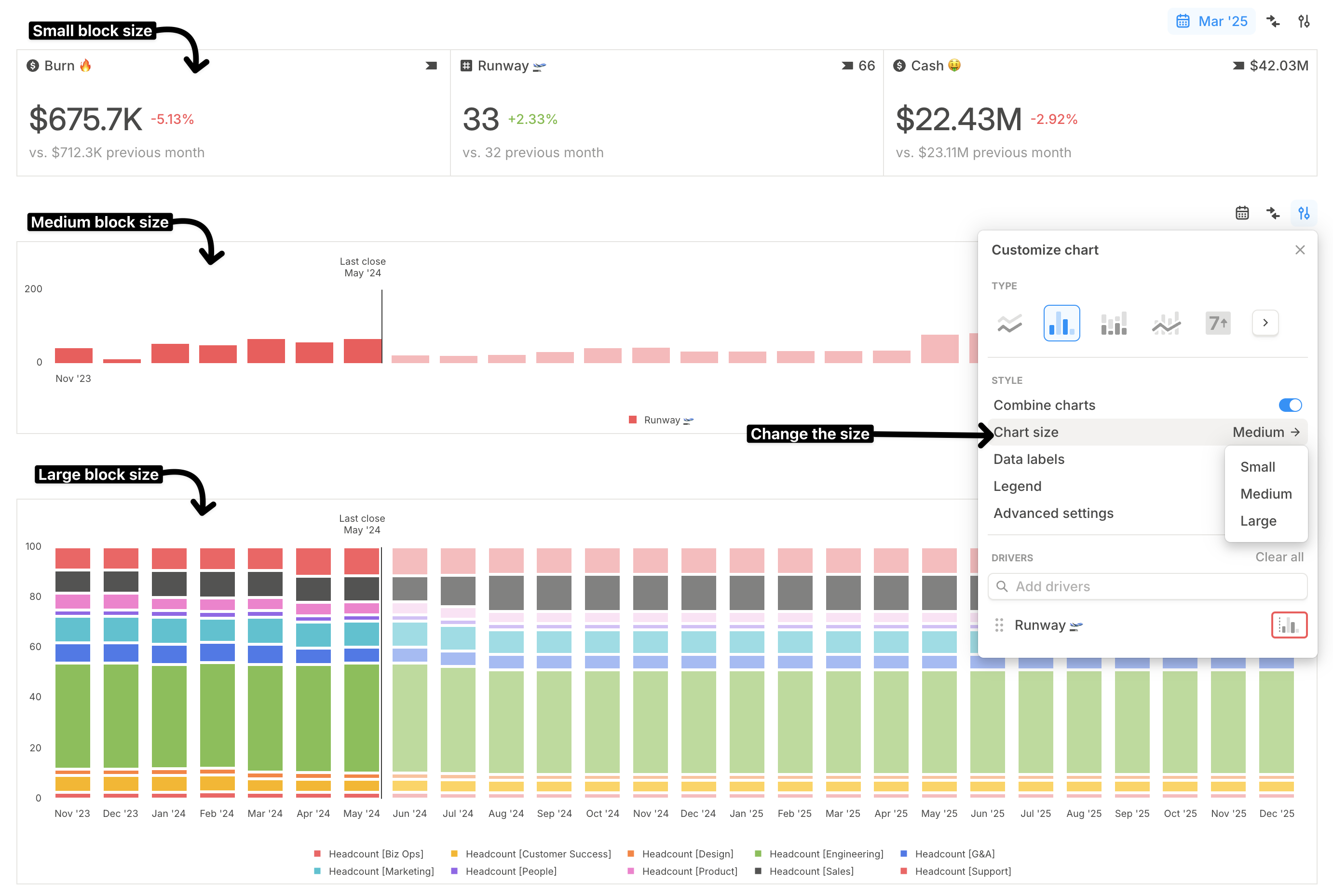
Chart size
You can choose from three chart block sizes: small, medium, and large.- Small works best for value charts if you want a more compact layout.
- Large is better for more detailed charts like combo or stacked column charts, making them easier to read.
Data labels
If you want data labels to always be visible instead of only showing on hover, turn on the Data labels toggle.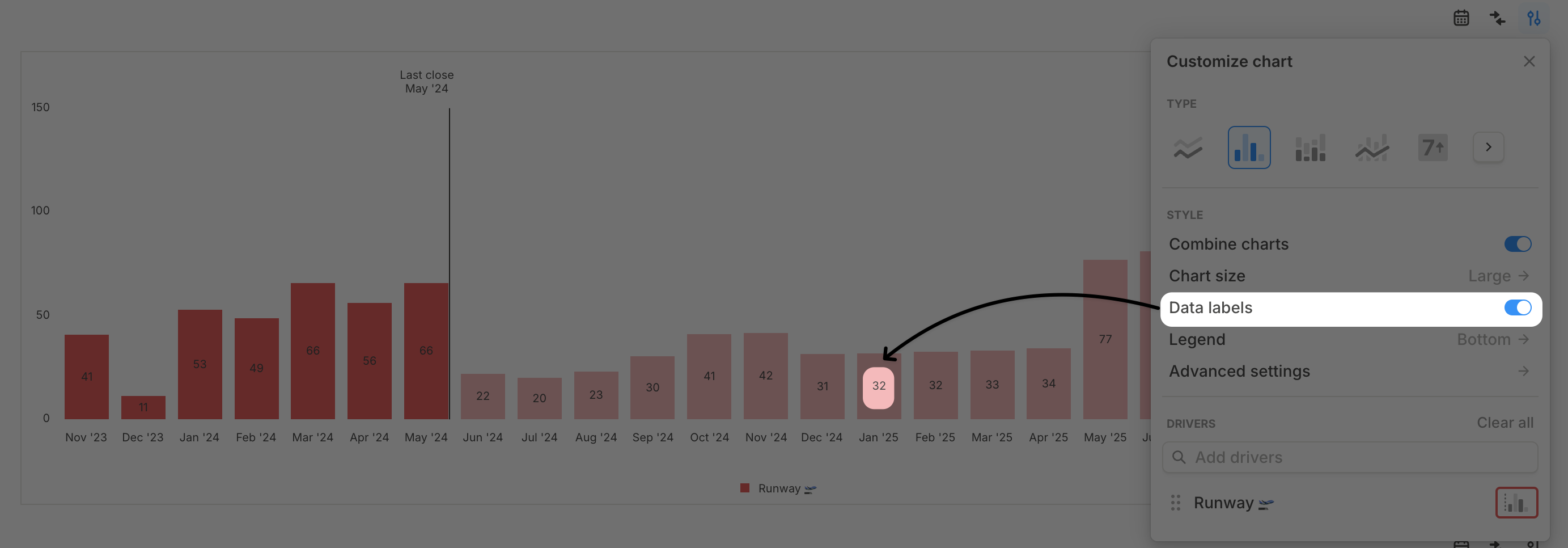 You can also tweak font size, weight, and color under Advanced settings > Label settings.
Legend
By default, the legend is hidden, but you can show it on the right, left, top, or bottom of the chart. The legend is interactive—clicking on a driver will toggle its visibility on the chart.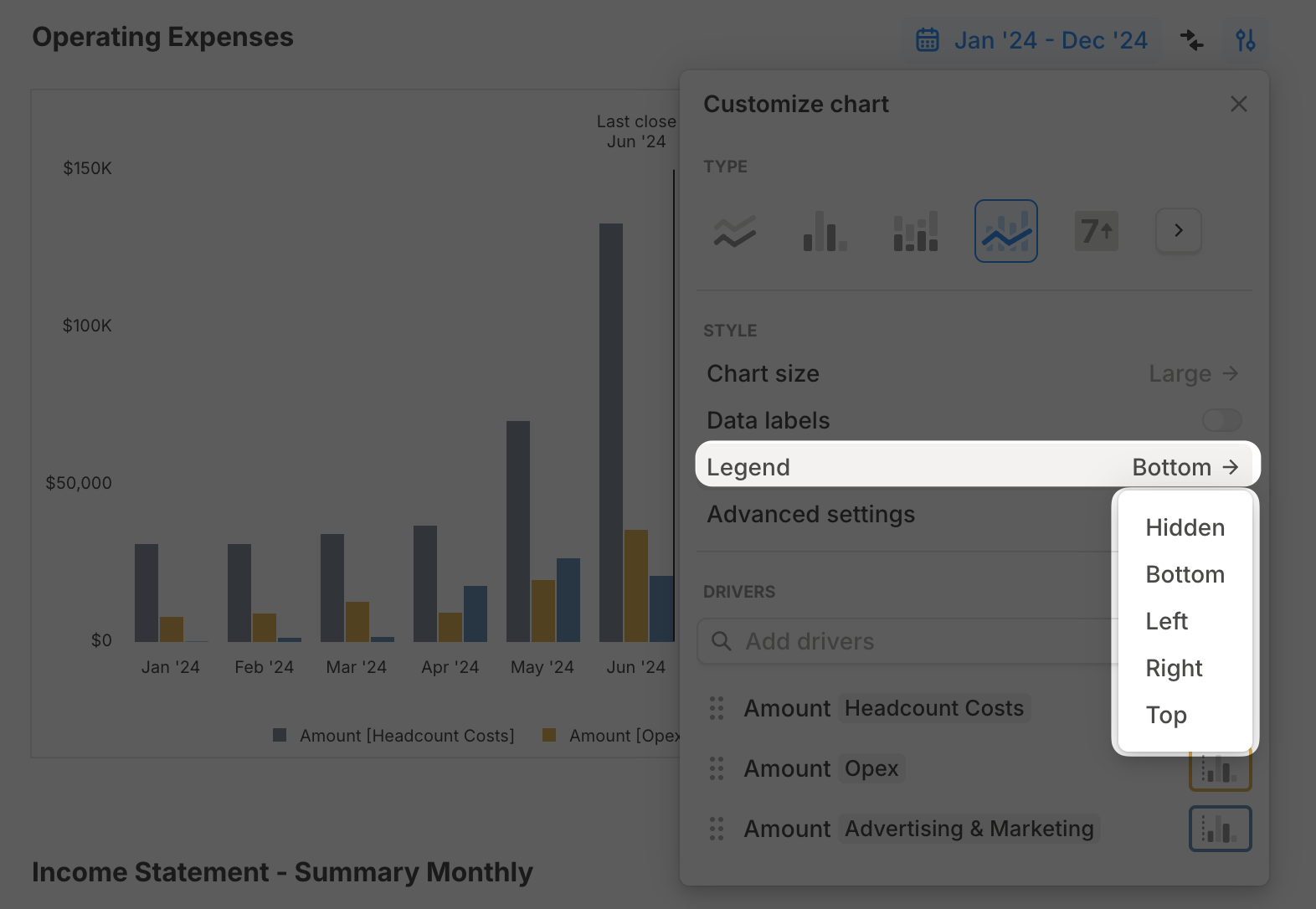
Driver-level customizations
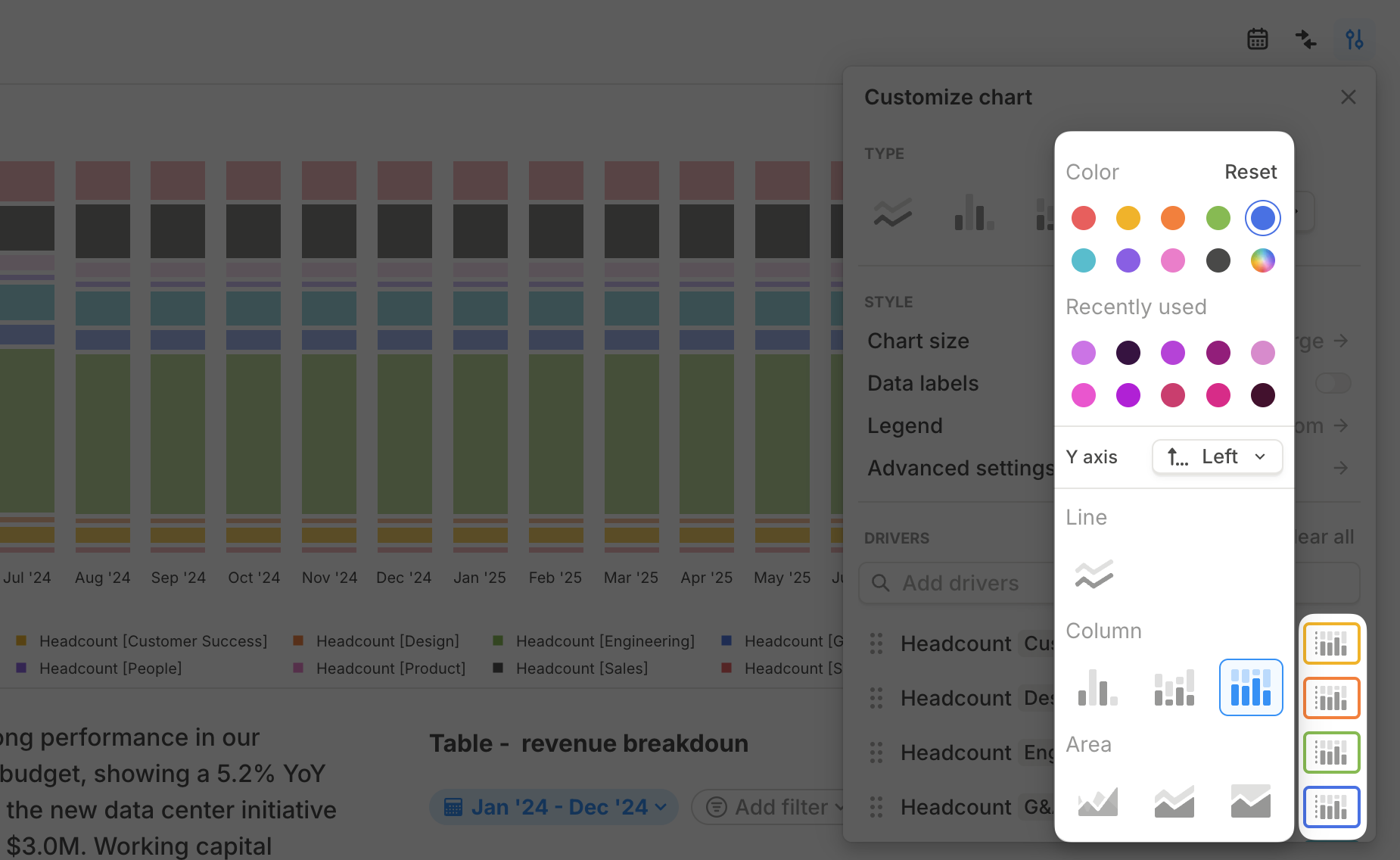
Beyond general chart settings, you can customize each driver individually to refine how data is displayed. To do this, click the Customize chart button and scroll to see the list of drivers.- Change driver color – Click the button next to a driver’s name to update its color. Choose from 10 default vibrant colors or select a custom color by clicking the multi-color circle.
- Quick access to custom colors – Your 10 most recent custom colors are saved for easy reuse across charts.
- Switch the driver’s axis – By default, drivers are mapped to the left Y-axis, but you can change it to the right Y-axis (more on this in the next section).
- Change the driver’s chart type – Once you modify a driver’s chart type, the chart automatically becomes a combo chart.
- Add or remove drivers – Use the search bar to add more drivers or click the six-dot menu next to a driver to remove it or open it in the details view.
If you’re using waterfall charts, the per-driver customizations work differently to better suit this chart type. More details can be found here.
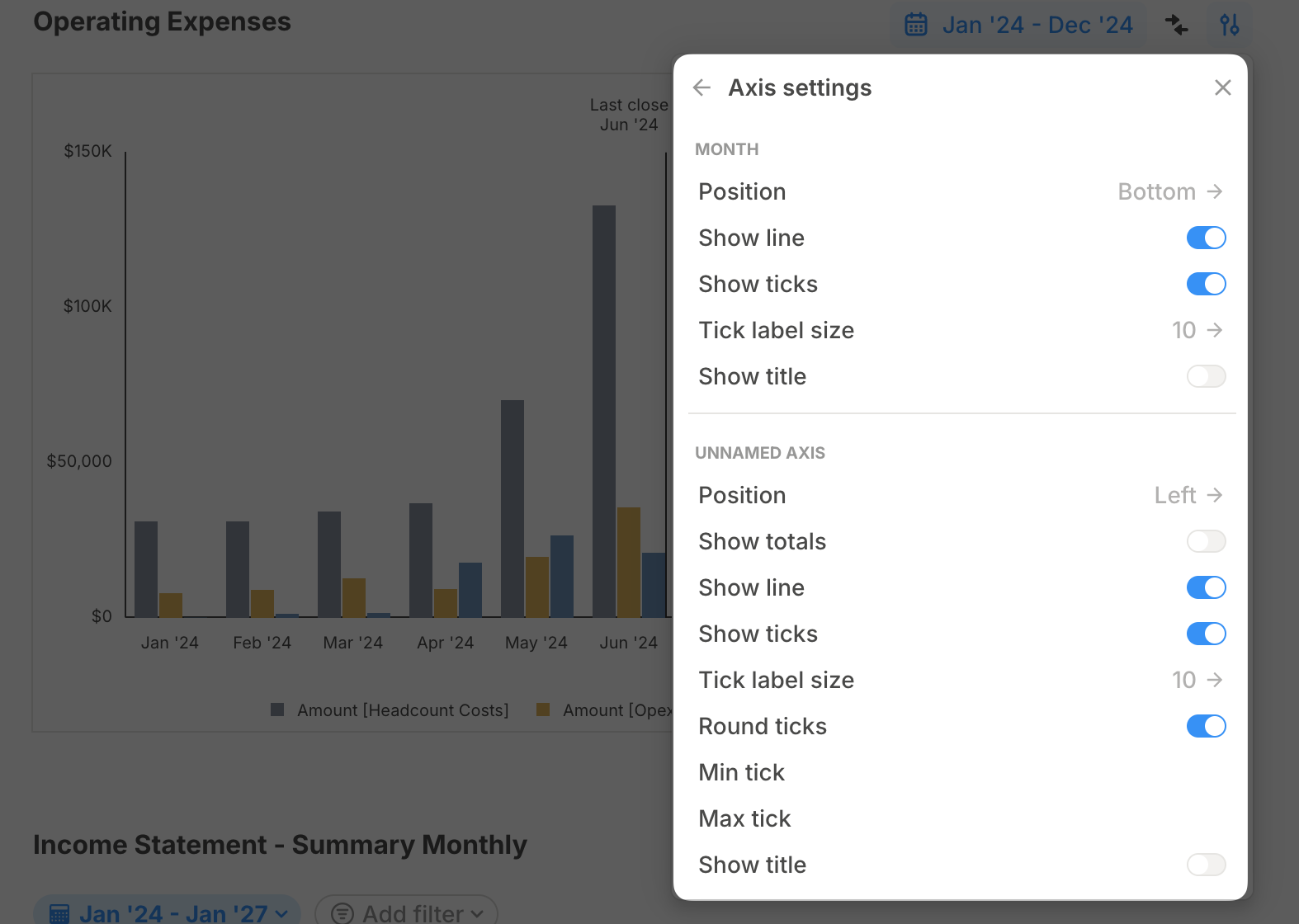
Axis settings
In addition to changing which Y-axis a driver is plotted on, you can further customize the look of your axes in Advanced settings > Axis settings. Here, you can:- Move the X-axis from bottom to top
- Show or hide a solid line for each axis
- Show or hide axis ticks
- Add a title to each axis
Date range
By default, every block on a page inherits the page-level date range. However, you can override this by adjusting the date range at the chart level, allowing you to customize time frames for specific charts without affecting the rest of the page.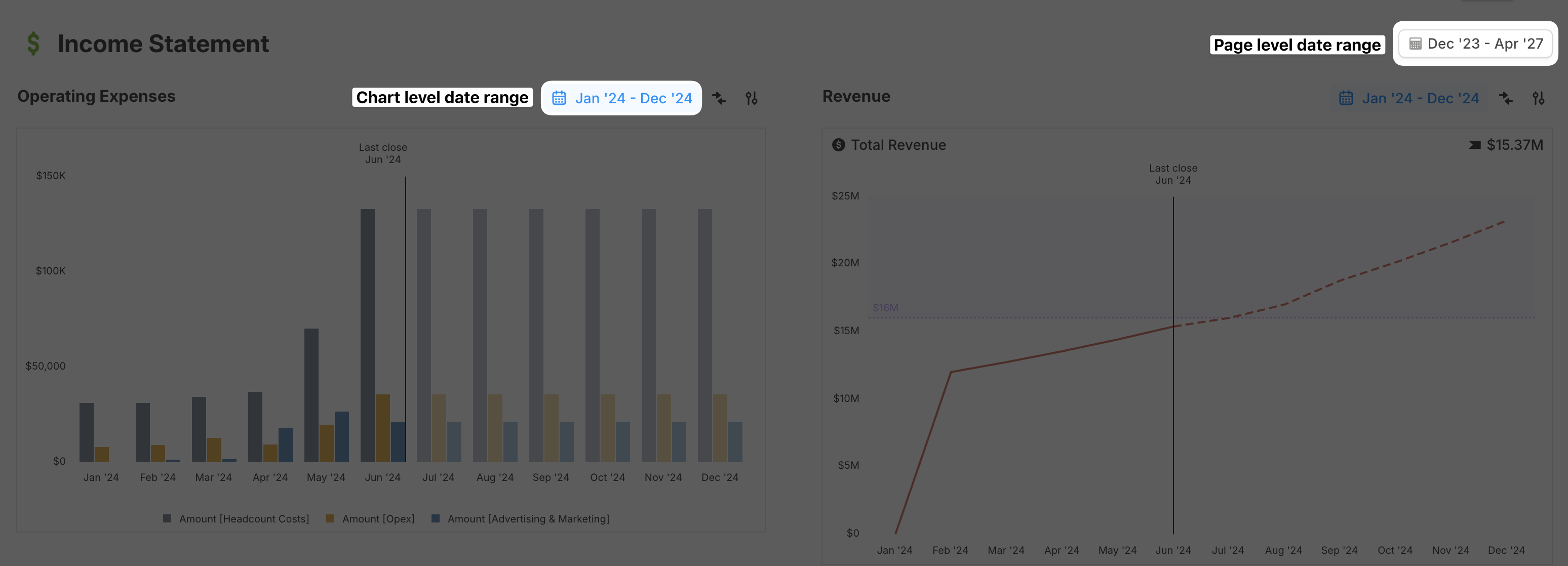
Rollups
You can add quarterly and annual rollups to your timeseries charts. This allows you to view aggregated data at different time granularities directly on your charts. To add rollups:- Click Customize chart on your chart block.
- Select Rollups.
- Choose from Quarterly, Annual, or both.
Rollups only work on timeseries charts (line, column, area, combo). They are not available for non-timeseries chart types like sankey, value, or waterfall charts.
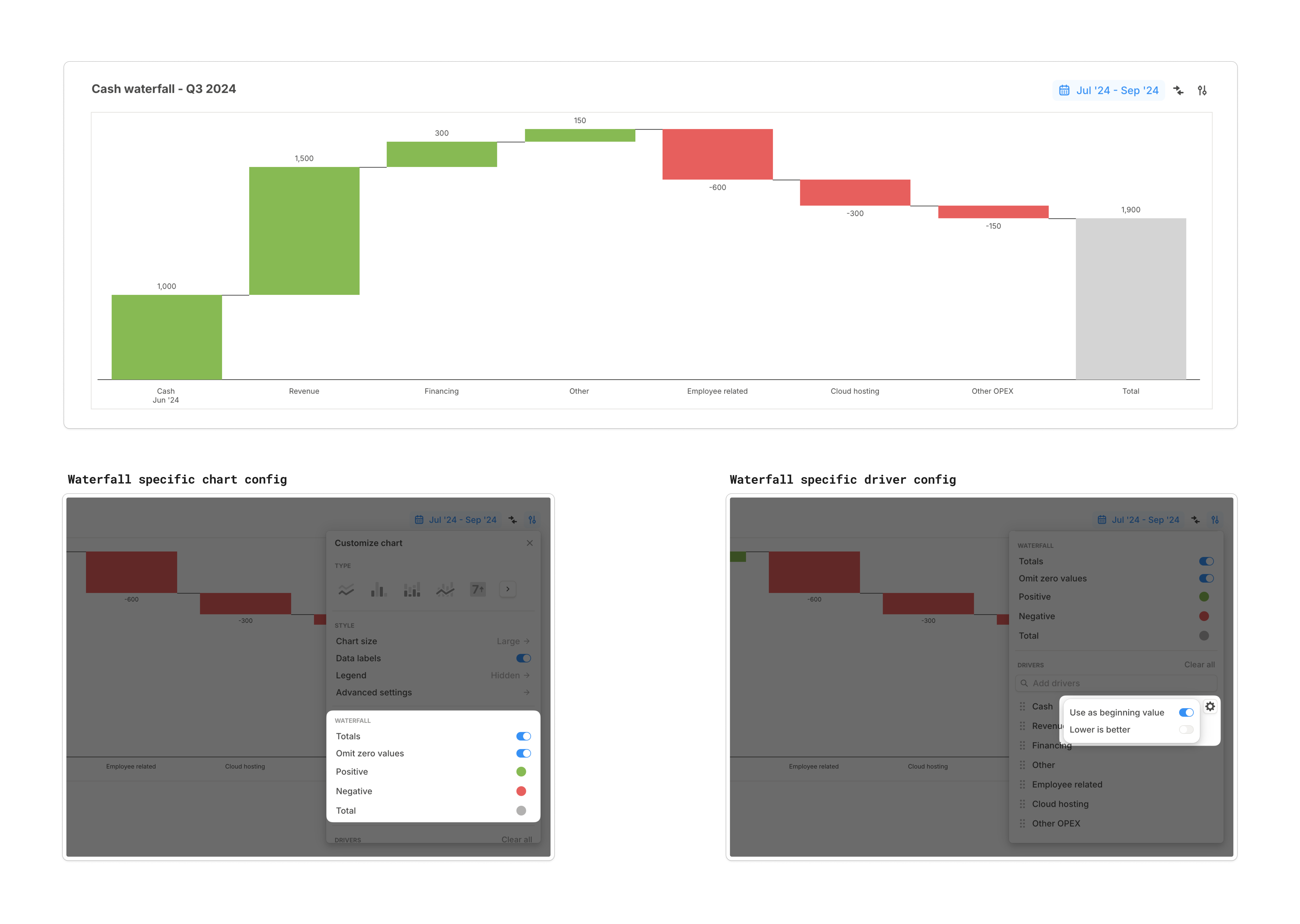
Waterfall charts specific customizations
Waterfall charts provide a clear, intuitive way to visualize how a key metric evolves from a starting value to an ending value by breaking down the positive and negative contributions of various inputs.- By default, the waterfall chart respects the sign of the values coming from each driver. But what if you need to flip it? For example, an expense driver might be presented in Runway with a positive sign. No problem—just click the settings icon next to the driver name and enable Lower is better.
- In most cases, you’ll want the leftmost column to pull its value from the end of the previous period. For example, if your waterfall chart visualizes how Cash has changed this quarter, the starting cash value should come from the ending balance of the previous quarter. No need for helper drivers—just enable Use as beginning value for that driver.
- All floating bars in between represent how other drivers impact your starting value, summing values across the selected time range.
- Waterfall charts include specific configurations like Totals, Omit zeros, and customizable colors for positive, negative, and totals values.
Scenario comparison on charts
If you’re using a line or column chart, you can compare the same drivers across multiple scenarios. Simply click the Compare button and select the relevant scenarios.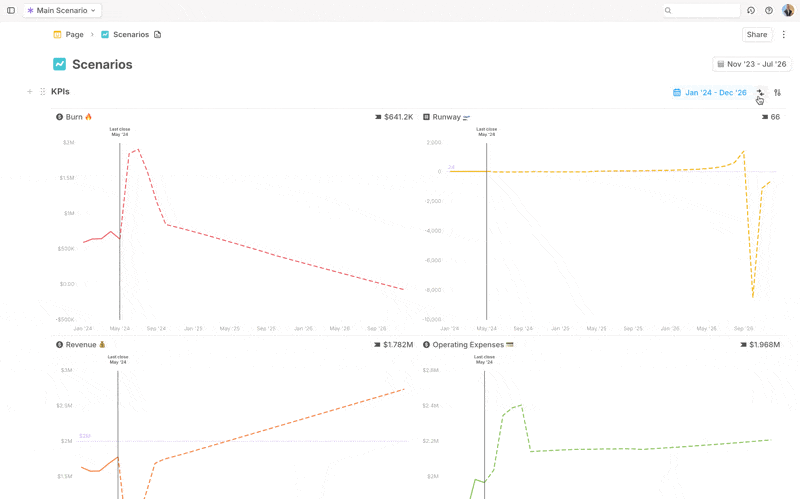
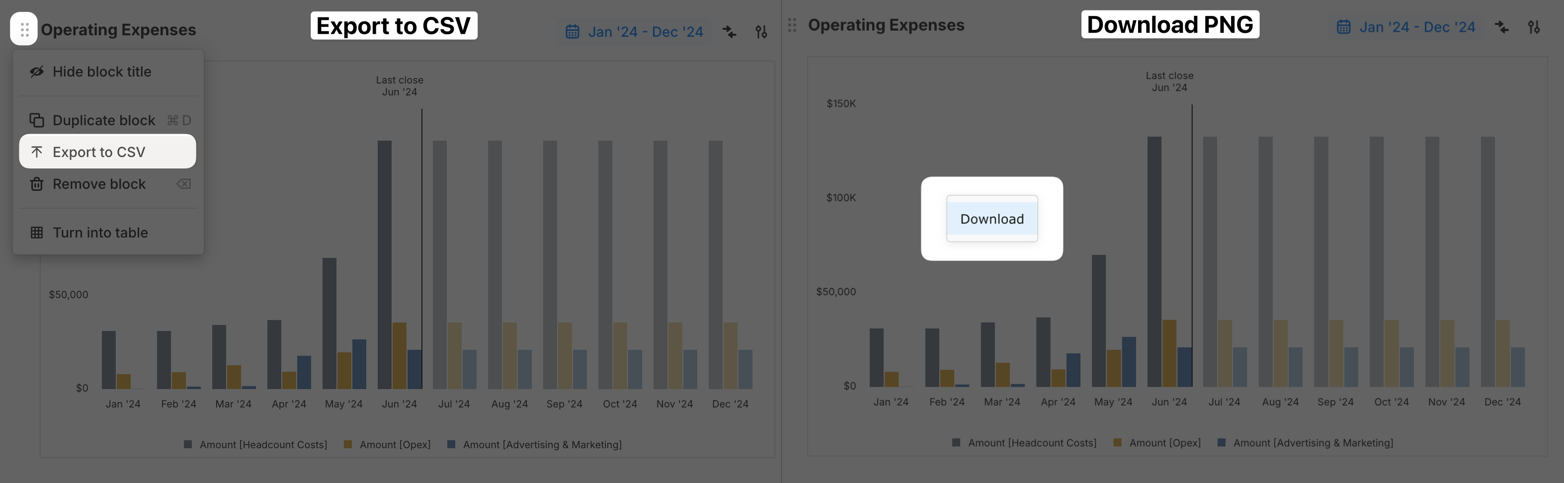
Exporting charts
You can download a chart block in two ways:- Export the data as a CSV – Click the six-dot button on the top left of the block and select “Export to CSV.”
- Download the chart as a PNG – Right-click on the chart and select Download.
Charts FAQs
Can I view my chart data by quarters or years instead of just months?
Can I view my chart data by quarters or years instead of just months?
Yes! You can add quarterly and annual rollups to timeseries charts. Click Customize chart, select Rollups, and choose Quarterly, Annual, or both. Note that rollups are only available for timeseries chart types (line, column, area, combo) and not for charts like sankey, value, or waterfall.
Waterfall charts display the entire date range as a single period. Is there a way to break it down into quarters?
Waterfall charts display the entire date range as a single period. Is there a way to break it down into quarters?
You’re right—Runway’s waterfall charts currently display the time range as a single period. We’ll be adding support for breaking it down into quarters and years in the near future.In the meantime, you can create separate waterfall charts for each quarter or year you’re interested in. And as always, let us know if this feature is important to you!